

Key Takeaways
- Use tables when people need to quickly compare related records, values, or statuses.
- Prioritize the columns that support the main user task and move secondary details out of the default view.
- Choose responsive behavior based on the data and task, rather than forcing every table into the same mobile layout.
- Make headers, sorting, filters, focus states, and status indicators understandable for every user.
- Test with realistic content, keyboard navigation, zoom, small screens, and assistive technology.
Data tables are still one of the most effective interface patterns for helping people compare many related items at once. Whether users are reviewing invoices, inventory, employees, subscriptions, or project tasks, a well-designed table makes patterns, exceptions, and next actions easier to find. Reviewing strong table ui examples can also help teams spot useful hierarchy, spacing, and interaction patterns before moving into design and development.
The goal is not to fit every available field on screen. Clear tables focus attention on the information needed for the current decision, then make supporting information available without disrupting scanning. This matters even more on smaller screens, where unreadable columns and hidden context can quickly turn a useful dataset into a frustrating experience.
Why Tables Still Matter In 2026
Tables work because they preserve relationships. A reader can move down a column to compare prices, move across a row to understand one record, and scan headers to confirm what each value means. Cards are often visually appealing, but they can make direct comparison slower when users need to evaluate many records against the same criteria.
A strong table is selective. It displays the most valuable facts first, uses clear labels, and avoids turning every cell into a destination. Details such as notes, history, attachments, or long descriptions can appear in an expandable area, side panel, or dedicated record page.
When To Use A Table Instead Of Cards Or Lists
Use a table when records share the same fields and readers need to compare those fields across multiple items. If each item has a unique story, image, or long description, another pattern may be easier to read.
- Choose a table for reports, account management, schedules, inventories, and comparison-heavy workflows.
- Choose a list for notifications, tasks, messages, or single-column content.
- Choose cards for products, profiles, portfolios, and browse-first experiences.
- Choosing a chart when identifying trends matters more than reading exact values.
Plan The Information Before Designing
Useful table design starts before visual styling. First, define the question users should be able to answer. For example, an operations manager may need to find overdue orders, while a finance user may need to compare payment amounts and dates. Those are different tasks, so they should not automatically receive the same default columns.
- Identify the primary user goal and most frequent action.
- List all possible fields, then remove fields that do not support that goal.
- Rank columns by importance and place high-priority content near the beginning.
- Decide which values genuinely benefit from sorting, filtering, or searching.
- Test sample content with short labels, long names, missing values, and large numbers.
Keep related values together. A customer name and account status may belong near each other, while internal identifiers can usually move farther right or into a detail view. This simple content decision often improves usability more than adding visual decoration.
Create A Clear Table Structure
Every column needs a concise, specific heading. Avoid vague labels such as “Info,” “Details,” or “Date” when several types of information could fit. Use consistent date formats, currency formats, capitalization, and status terms so people do not need to interpret each row from scratch.
Structure Rules That Support Fast Scanning
- Left-align most text labels and align numbers consistently for quick comparison.
- Use short headers that match the language users see elsewhere in the product.
- Give empty cells meaningful text, such as “Not assigned” or “No due date.”
- Keep actions in the same location for every record.
- Break complex datasets into separate, smaller views when topics change.
Accessibility should shape the structure from the beginning. Guidance on preserving the structural relationship between headings and data is especially important when layouts change for smaller screens or when text is enlarged.
Choose A Responsive Pattern
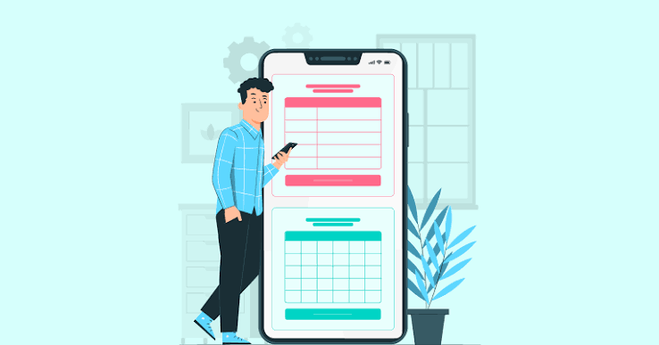
A responsive table should not simply shrink until its text is unreadable. Instead, choose a pattern that preserves the essential relationship between labels and values.
- Horizontal scrolling: Best for comparison-heavy data, such as financial figures or product specifications, where seeing columns side by side is essential.
- Priority columns: Shows the most important fields by default and makes lower-priority details available through a controlled action.
- Stacked records: Converts each row into a vertical summary, which can work well for customer lists, contacts, and simple status tracking.
- Expandable details: Keeps a compact overview while allowing users to reveal supporting values only when needed.
Do not hide critical information merely because the screen is narrow. If a value affects a decision, show it in the compact view or provide an obvious, accessible route to it.
Make Sorting And Filtering Accessible
Sorting, filtering, pagination, and search can reduce effort when used purposefully. They create friction when all possible options are exposed at once. Use real buttons and form controls, clearly communicate the active sort order, and ensure the current state remains understandable after results change.
- Provide visible keyboard focus for every interactive control.
- Use text and icons together for sort direction or status changes.
- Keep filter labels close to the controls they describe.
- Include a clear way to remove active filters.
- Preserve context when results update so users do not lose their place.
Improve Visual Readability
Visual clarity comes from hierarchy and rhythm. Give cells enough padding to separate records, use subtle row dividers or alternating backgrounds when they help tracking, and reserve strong color for meaningful states. Dense borders, excessive badges, and decorative icons usually add noise rather than clarity.
Long content needs a deliberate rule. Product names may wrap, notes may truncate with a way to reveal the full value, and identifiers may use a fixed-width style when accuracy matters. Sticky headers can be useful for long lists, but they should not obscure content when users zoom or navigate with a keyboard.
Avoid Common Table Design Mistakes
Showing Too Many Columns
Every extra column increases scanning effort. Put secondary information behind an expandable detail area or on a record page, rather than making every row wide by default.
Using Color As The Only Signal
A green or red status is not enough on its own. Pair color with a readable label, icon, or shape so the meaning remains clear in different viewing conditions.
Making Every Cell Interactive
A table filled with links creates a long and confusing keyboard path. Make the primary row action obvious, then provide a small number of secondary actions where users expect them.
Use A Practical Testing Checklist
Test with real tasks rather than just reviewing a polished mockup. Check the experience on wide and narrow screens, at 200% and 400% browser zoom, with keyboard-only navigation, and with long or missing content. Verify that users can identify headers, reach actions, understand active filters, and access all important fields on a phone.
Teams should also validate semantic markup, focus behavior, sorting, pagination, and responsive changes before release. Practical guidance for testing tables in websites and applications can help turn accessibility requirements into repeatable quality checks.
Conclusion
Clear, responsive data tables begin with a clear user task. Prioritize the right fields, maintain understandable relationships between headings and values, and select a mobile pattern that fits the dataset. When content strategy, visual hierarchy, accessibility, and realistic testing work together, tables remain useful on large monitors, small phones, zoomed displays, and assistive technology.