

Key Takeaways
- Visibility: The contact page must be easily findable on your site to encourage user engagement.
- Simplicity: Clean design and minimal required fields reduce friction and increase submissions.
- Mobile Optimization: Responsive and touch-friendly layouts are essential for today’s users.
- Trust Signals: Testimonials and security badges inspire confidence and encourage outreach.
- Clear Call-to-Action (CTA): Well-positioned, compelling CTAs are crucial for conversion.
Introduction
The contact page is a pivotal element in any website’s journey to convert curious visitors into active leads. A well-designed contact page not only facilitates open lines of communication but also plays a central role in establishing credibility and trust. Research consistently shows that optimizing this page can significantly boost conversion rates by reducing barriers for users reaching out. For inspiration on unique layouts and user experiences, explore this curated gallery of contact page designs. From building trust to ensuring usability across devices, every aspect of the contact page needs focus. An effective contact page does more than list an email address; it reassures users that their questions or concerns will be met with prompt professionalism, fostering a sense of connection with your brand. Companies with a thoughtful approach to their contact strategy tend to achieve better customer satisfaction, more qualified leads, and a stronger brand reputation. By integrating modern design principles, usability standards, and trust-building techniques, your contact page can become a powerful asset for your website.
As digital engagement becomes increasingly fast-paced, failing to optimize this crucial touchpoint can cause potential leads to slip away. Invest in a purposeful design and clear communication to set your brand apart in your industry. Placing the contact page link in a location that users naturally gravitate toward makes an immediate difference. The most effective approach is to include a clearly labeled “Contact” or “Contact Us” entry in both the main navigation menu and website footer. Doing so allows users to swiftly find the page regardless of where they are on your site, improving both usability and overall satisfaction. Avoid vague labels; clarity helps prevent confusion and keeps users focused on their objective. In addition, adding the contact page to your website’s sitemap can help not only visitors but also search engines understand the importance and accessibility of this page.
Simplifying the Contact Form
The key principle for contact forms is simplicity. Limiting the number of fields to only the most crucial information, typically name, email, and message, minimizes the effort required from users. When extra information is necessary, such as a phone number or company name, make these fields optional wherever possible. Simple forms create less resistance, reducing the chances of abandonment before submission. Your choice of input types also influences usability. For example, use email fields for emails and set clear placeholder instructions for each field.
Designing for Mobile Users
With a growing majority of users accessing the web via smartphones or tablets, mobile optimization is non-negotiable. Responsive design ensures your contact page looks and functions flawlessly across all screen sizes. Pay careful attention to the size of touch targets (such as buttons) and provide ample spacing between form fields to prevent accidental taps. This level of user-centric consideration leads to higher engagement from on-the-go visitors.
Equally important is keeping loading times fast and the layout uncluttered. A mobile-optimized contact form should be lightweight, easy to navigate, and accessible with a single tap from the home screen.
Building Trust Through Design
Trust signals have a tangible impact on a user’s decision to reach out. Incorporate testimonials from satisfied customers, security badges that indicate safe data handling, or assurances about how user data will be used. These elements show that your company values privacy and security, inspiring confidence in those ready to initiate contact. Alongside these trust signals, transparency about what happens after submission further boosts comfort. For instance, set realistic expectations by clearly stating typical response times (“We respond within 24 hours”) and outlining the next steps. This clarity lowers anxiety and aligns with user expectations.
Crafting a Compelling Call-to-Action
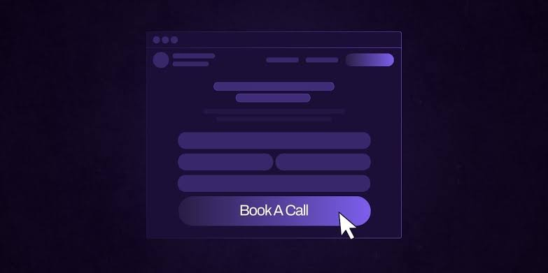
Your contact page’s CTA should be unambiguous and motivating. Use language that nudges users to complete the form, such as “Get Started,” “Request a Consultation,” or “Send Us a Message.” To maximize visibility, employ a color that stands out against the page’s background and situate the CTA in a prominent location, ideally directly below the form fields. A successful CTA not only captures attention but also communicates the benefit users will receive by making contact. This can be a free consultation, a quote, or simply the assurance of a timely reply.
Providing Multiple Contact Options
Not all users have the same communication preferences. Enhance accessibility by offering multiple ways to contact you, such as a direct phone number, a monitored email address, or links to your business’s social media profiles. For organizations dealing with high-value leads or urgent requests, implementing a live chat feature can provide real-time support and significantly improve user satisfaction.
Multiple channels mean that users can choose the medium that feels most comfortable or convenient for them, reducing friction and increasing conversion rates.
Conclusion
An effective contact page is more than just a form; it is a strategic touchpoint essential for building relationships, establishing trust, and turning visitors into valuable leads. By focusing on accessibility, simplicity, mobile responsiveness, trust-building, strong CTAs, and multiple communication options, you can create a contact page that supports your overall business goals. A well-designed contact page reduces friction, encourages meaningful interactions, and helps users feel confident reaching out to your brand. Providing clear instructions, clear expectations for quick responses, and convenient contact methods ensures a smoother experience for every visitor. Regularly reviewing user behavior and optimizing your page based on feedback can further improve engagement and conversions. When thoughtfully designed, your contact page becomes more than a communication channel, as it becomes a powerful tool for strengthening customer relationships, improving satisfaction, and driving long-term business growth.